The Courts, Creative Youth Network, Youth Advisory Board, Bristol, UK
Plural Studio was engaged by the charity Creative Youth Network (CYN) and directed by the Youth Advisory Board (YAB) as the interior designer for the sympathetic renovation of The Courts, Bristol. The Courts is a creative enterprise and co-working space for Bristol with an emphasis on creating opportunities for youth to integrate into the creative industries.
The brief from the YAB described a simple modern palette with minimalist furniture and decor. Through familiarizing ourselves with all the work already invested in the building as well as holding masterclass workshops with the YAB, Plural has developed the interior strategy for the courts and coordinated its implementation.
short video by Holly Cooper, a young CYN videographer
“It was an absolute pleasure to work with Plural. Alex and Anna took a really client-centred approach, not only to make our space aesthetically beautiful but really thinking about the experience that individuals have when using it. We’re super happy with how The Courts look and would definitely work with them again.”
—Rebecca Scott, Courts Project Manager and Head of Estates at Creative Youth Network
Historic Courts
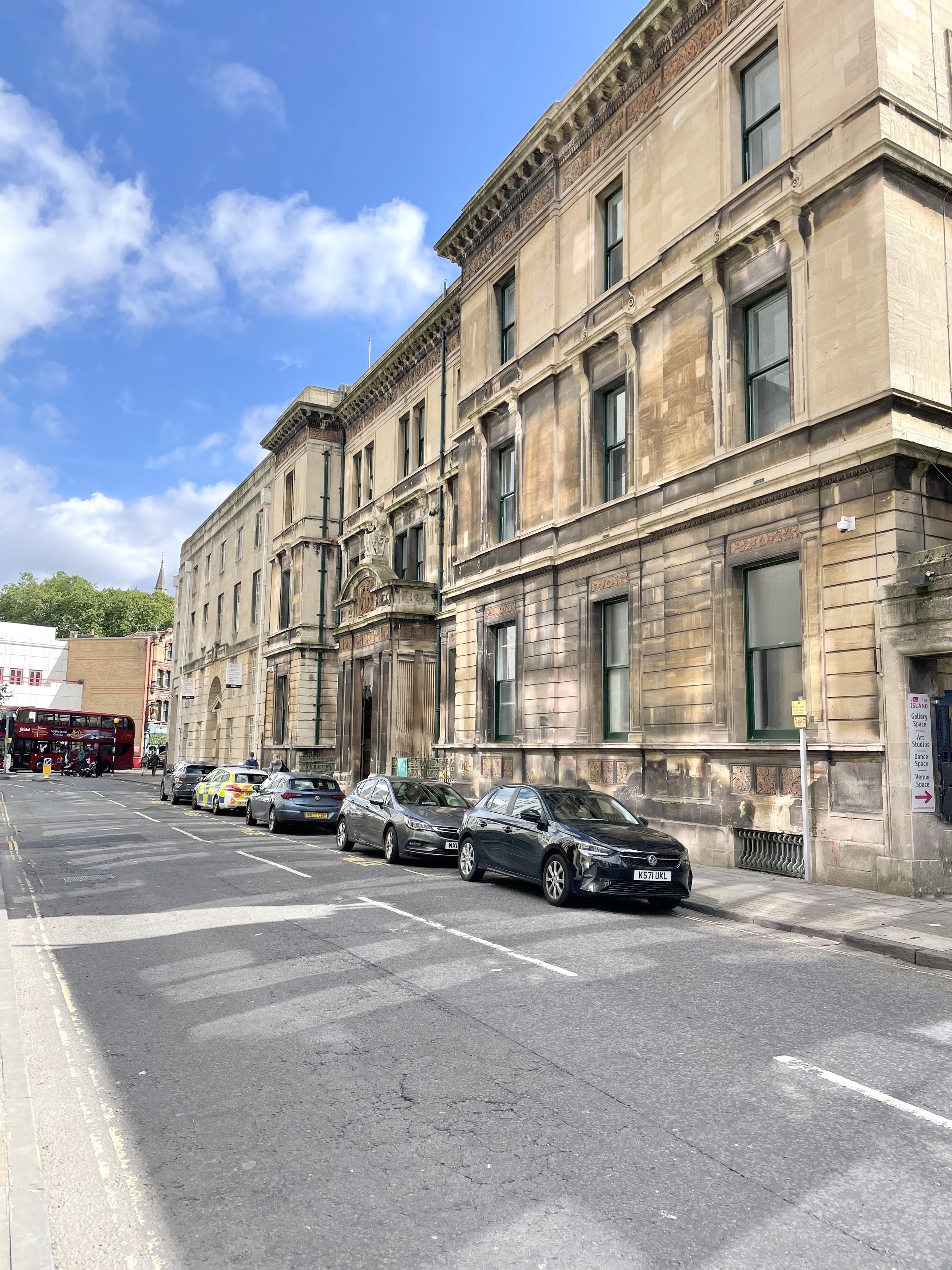


The magistrates or police courts were opened in March 1880. They dealt with a range of what were considered minor offences from common assaults to petty theft, to truancy and driving violations. The magistrates courts offered access to justice for all Bristolians. In 1881 alone, of the more than 17,000 cases heard here, the majority were brought by local working people. For some of the most vulnerable, the courts provided important protection against cruelty and violence.
- Creative Youth Network
Above: Entrance to The Courts on Bridewell Street; Stairs leading down from courtroom to basement holding cells; Basement holding cells.
Interiors

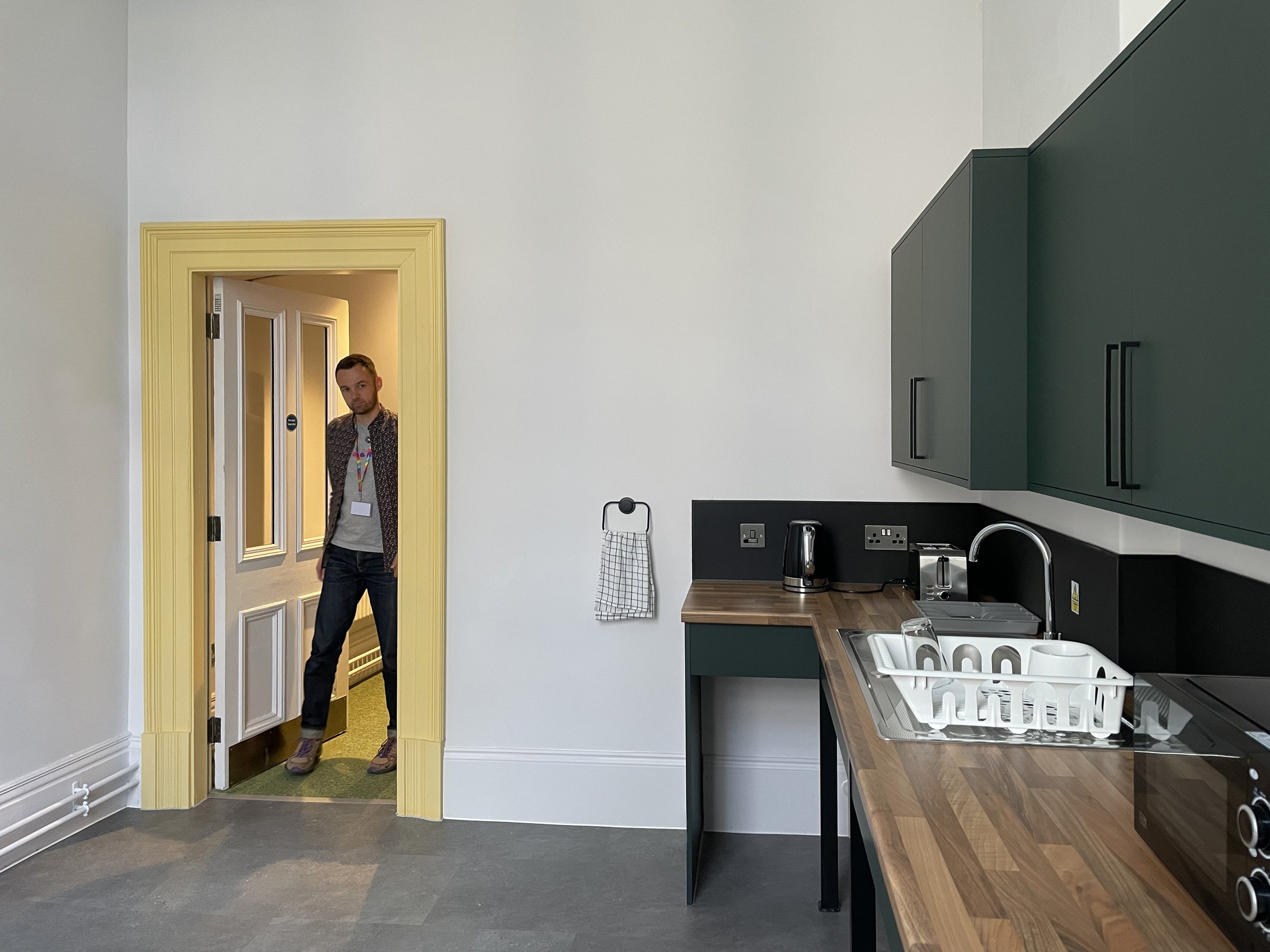

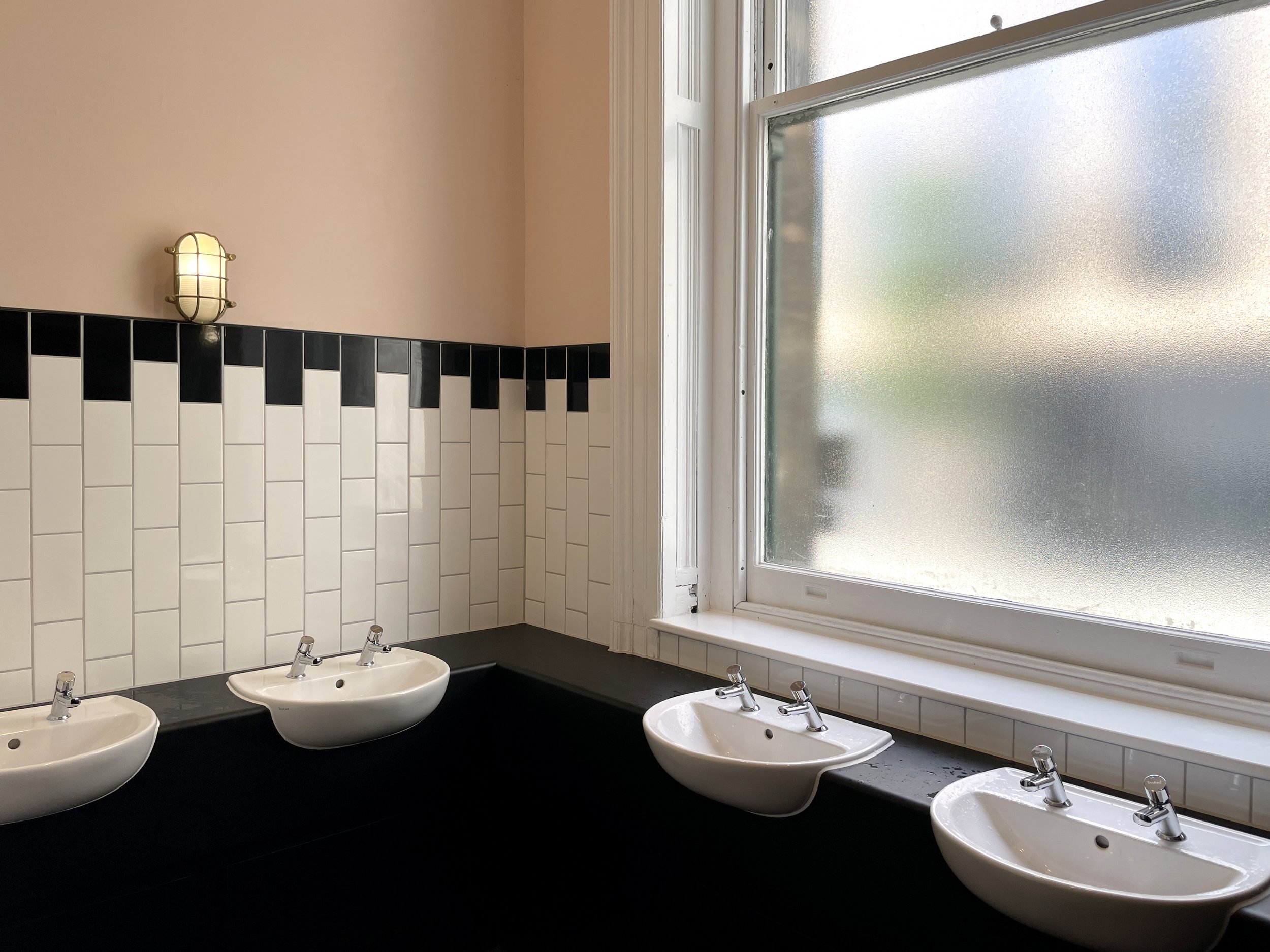

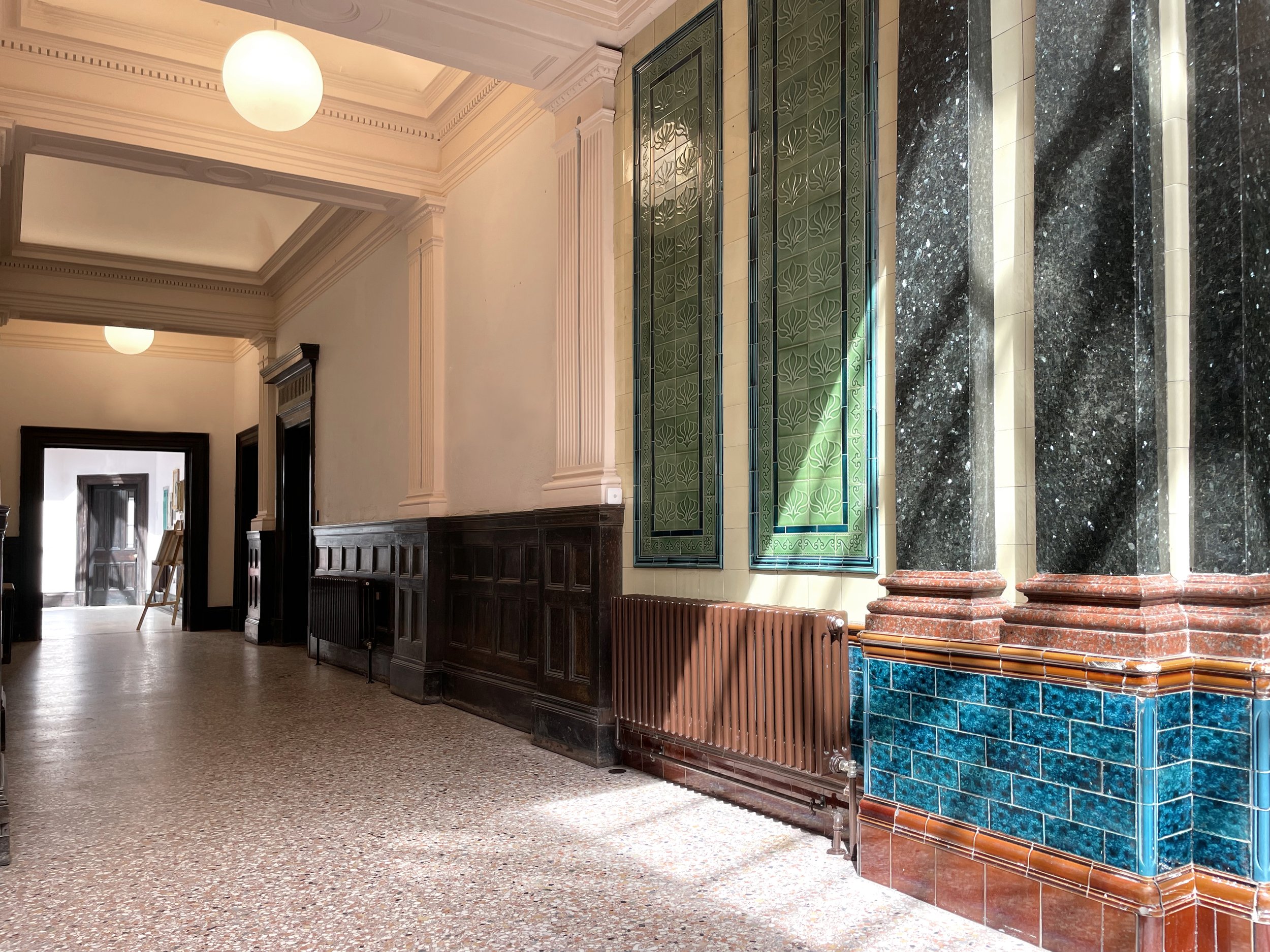
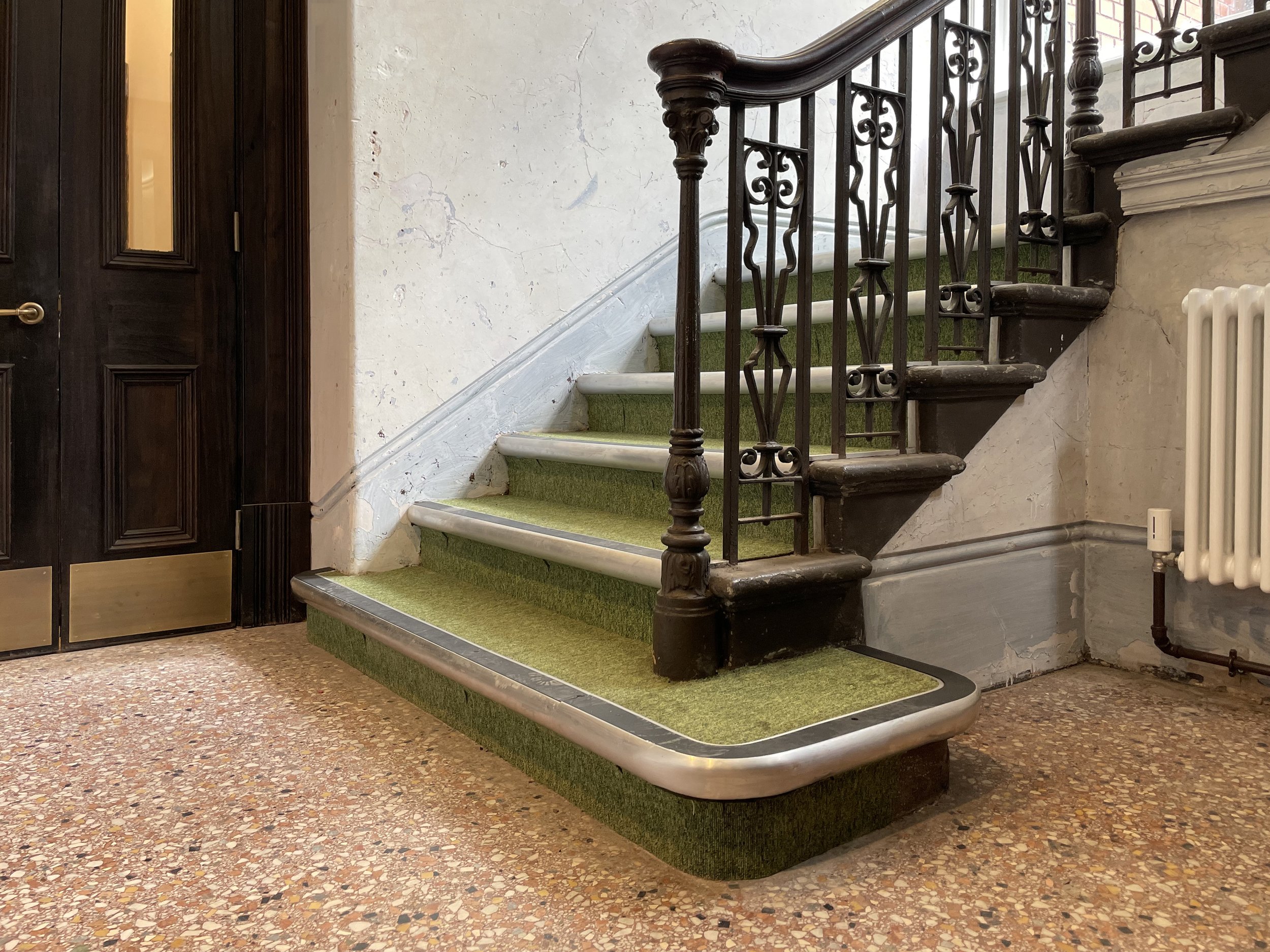
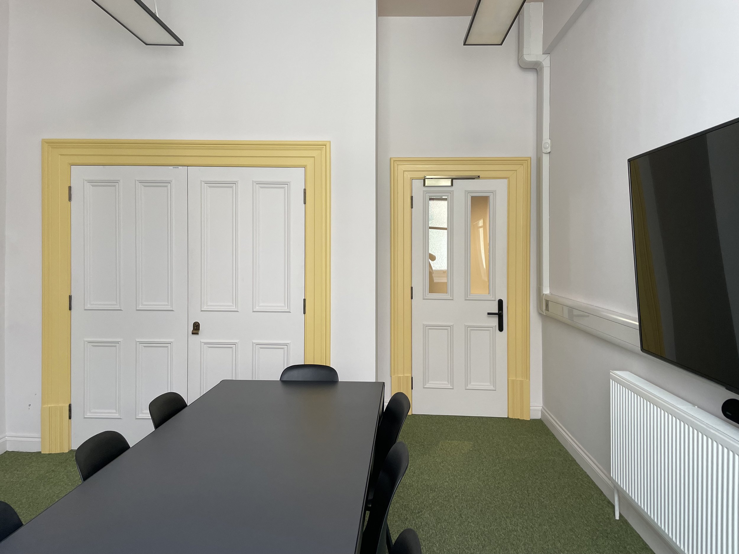

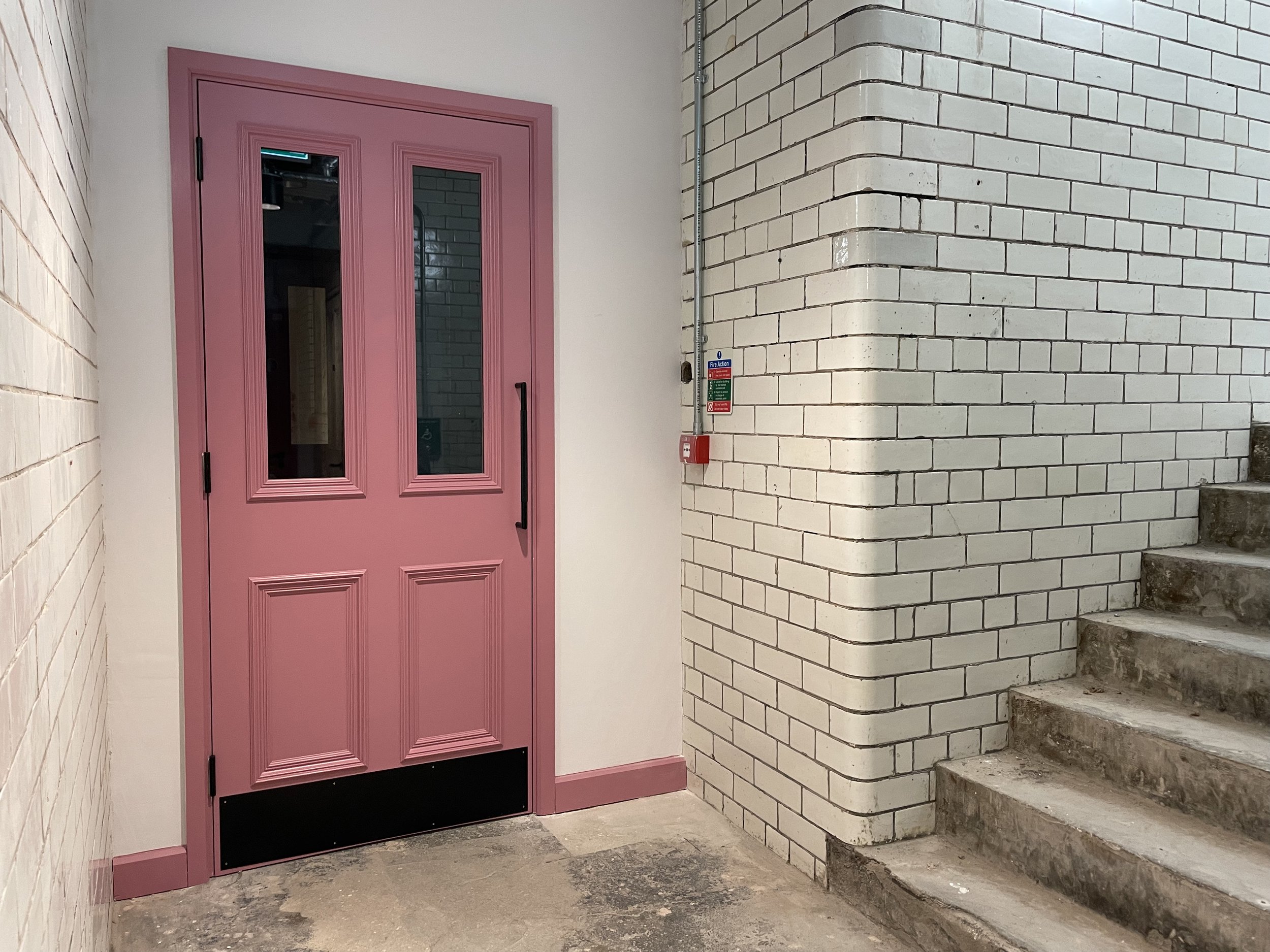
Calming and Invigorating The Courts
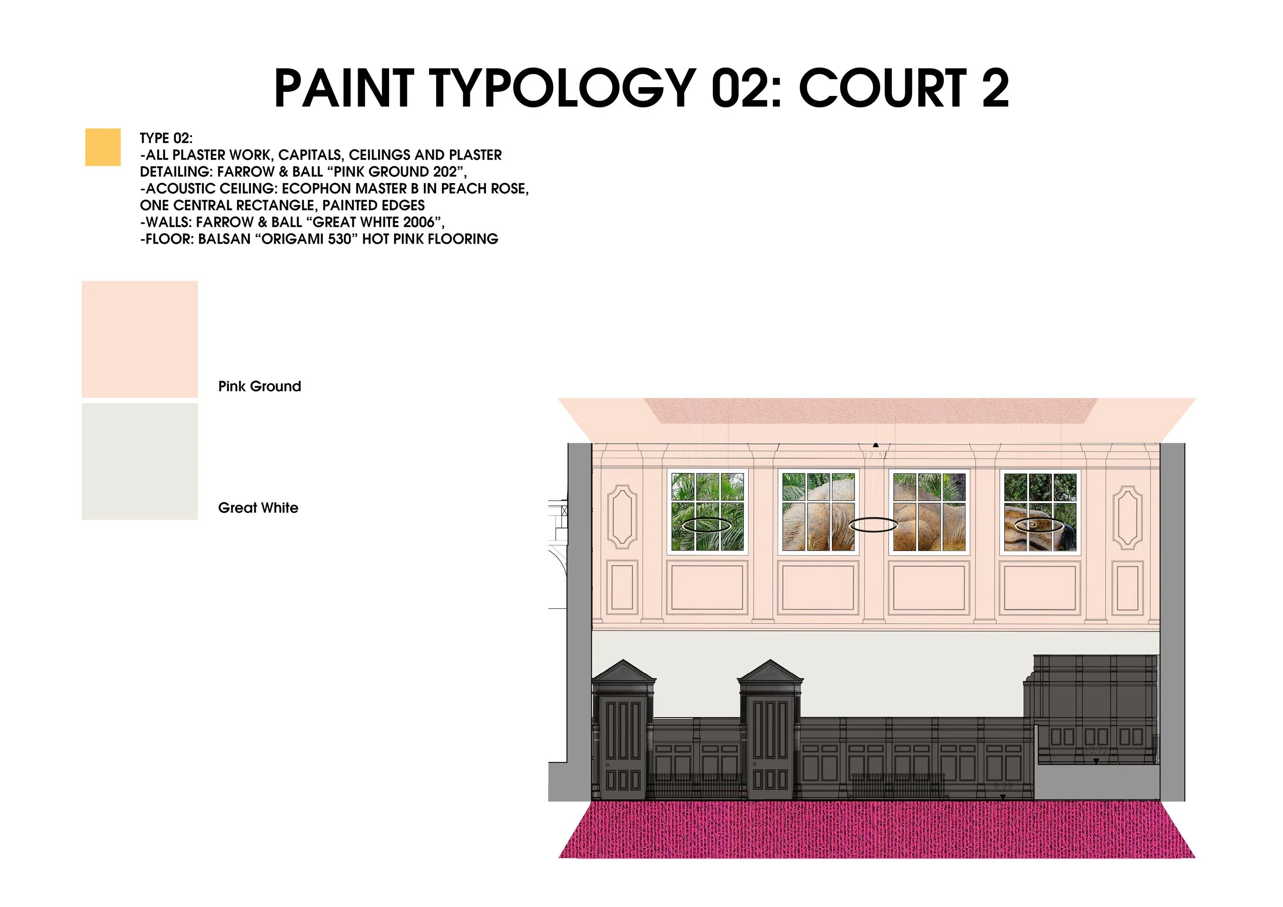
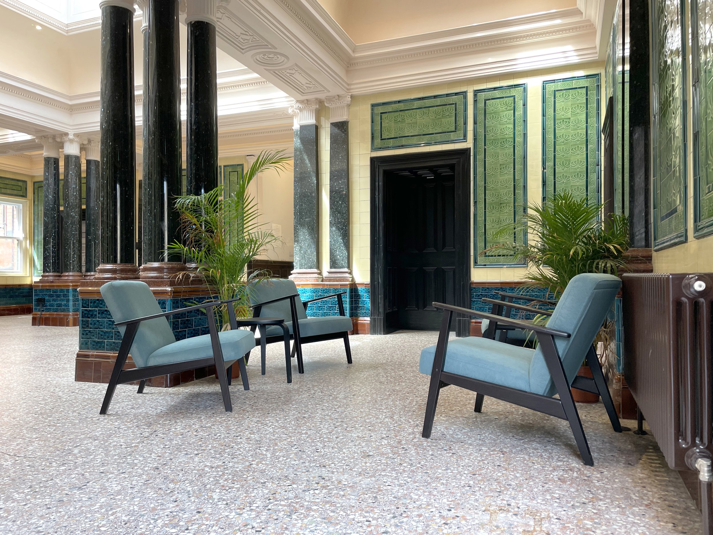
The journey of the interior decisions made in dialogue with the Youth Advisory Board (YAB) and Creative Youth Network involves many layers. They too will have their own take on how the building has turned out. The pink carpet is the signature starting point that describes the process from an interior point of view. The bright rebellious colour placed in the courtroom came out of several rounds of youth discussion. Plural wanted to do justice to this input from the YAB and their vision. We supported the bold statement as a way to reflect youth and justice as thematic to the project and the building's history.
Delivering a ‘Funky’ Interpretation
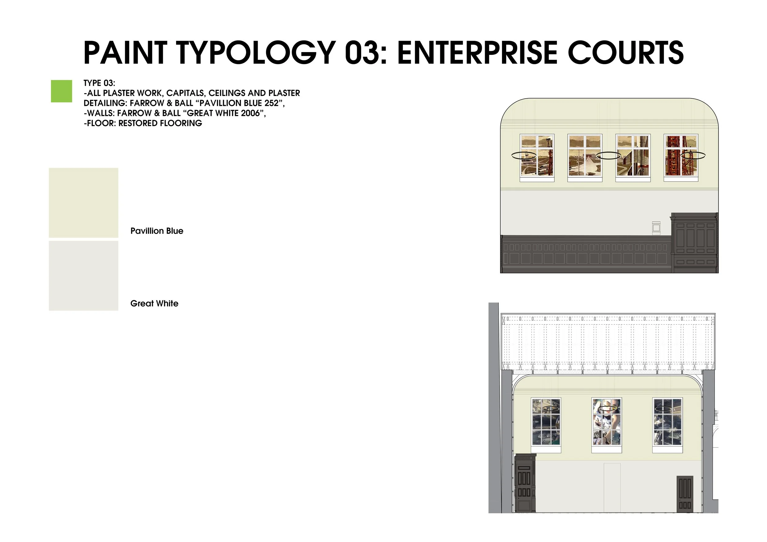
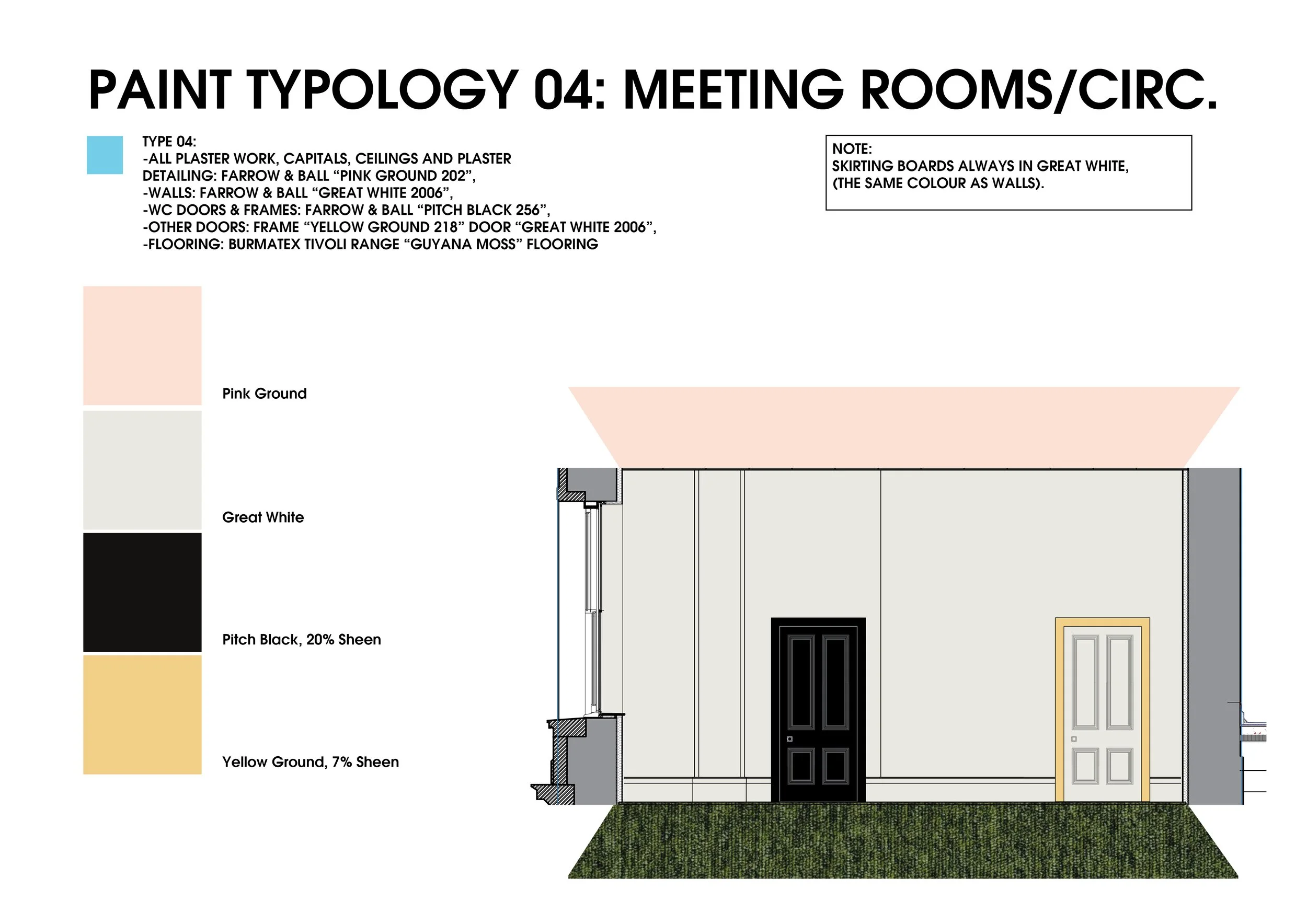
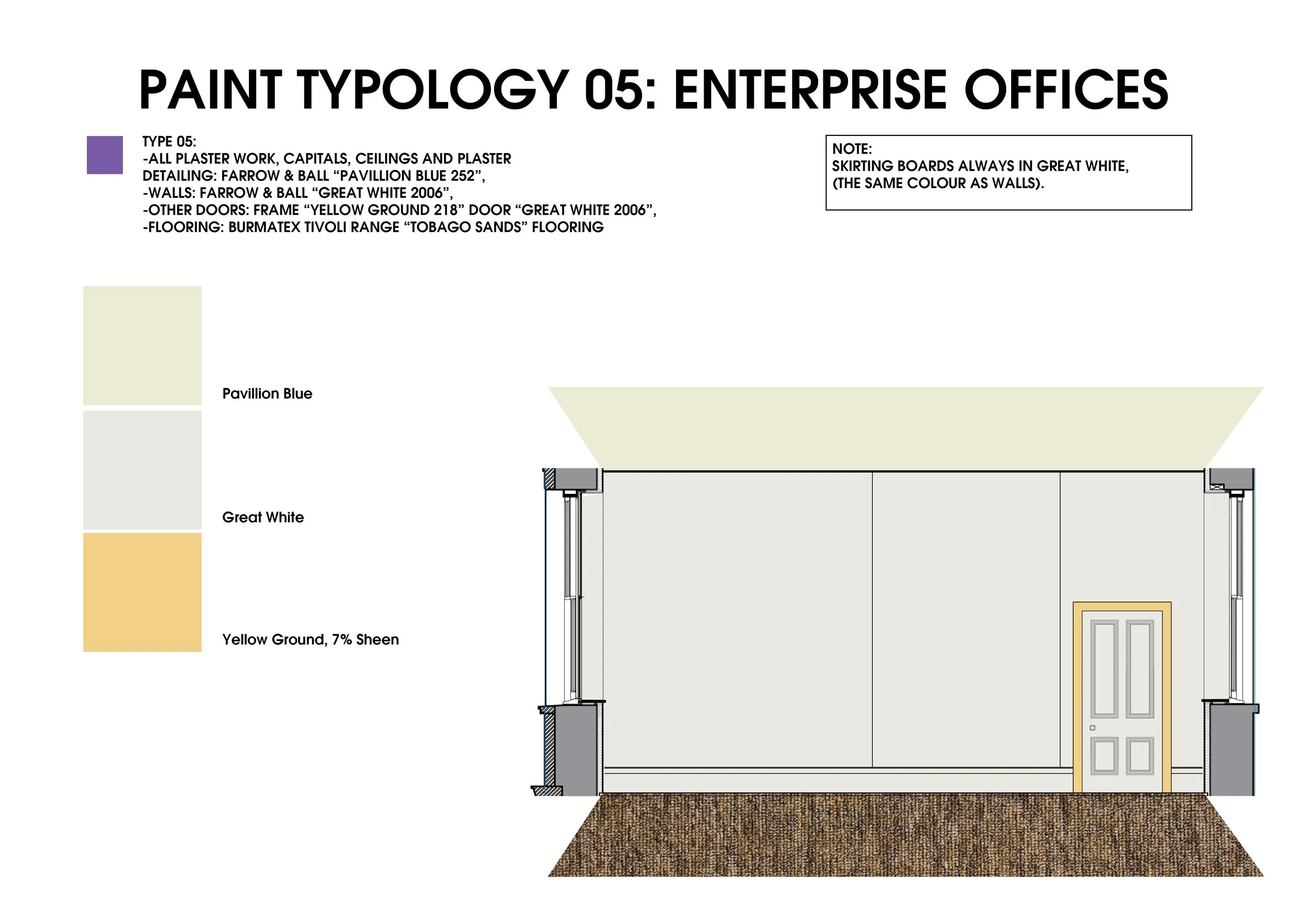
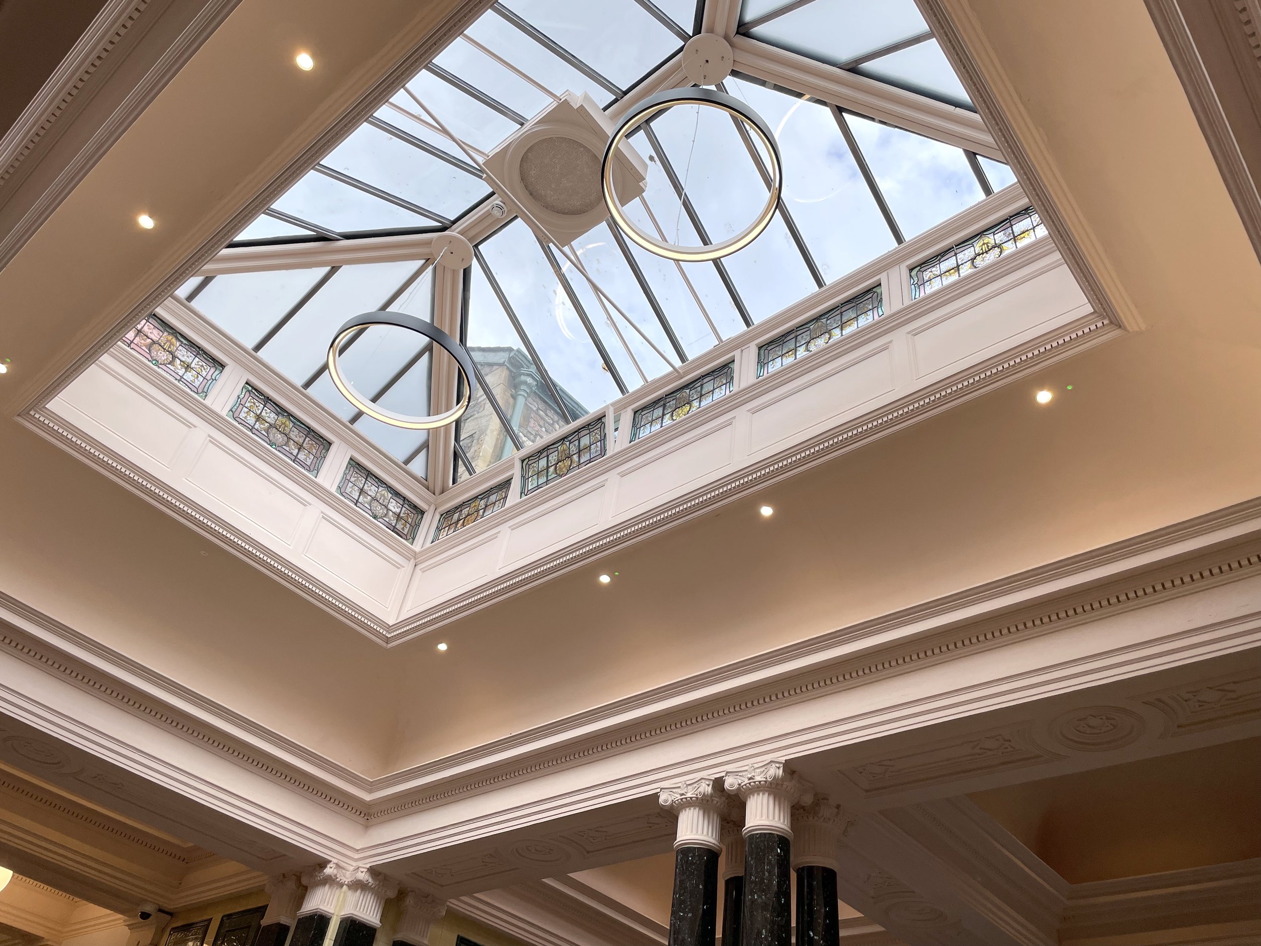
Visitors will notice the wall colours of the interior change depending on time of day and what is placed next to them. In this way we have co-created a chameleon building. The paint colours have been designed with YAB to refresh the courts for their new program. Plural specifically suggested these tones to celebrate plants and people, as these colours reflect well upon human skin. We also suggested to invert the neoclassical division of 'white tones to the top and decorative colours below'. Thus visitors will find the upper plasterwork and ceilings in pinks and green-blue throughout the building.
On the one hand, the outcome of YAB, Creative Youth Network and Plural Studio’s experimental collaboration at The Courts could be interpreted as a building size James Turrell light installation. On the other, the building could also be read as a spiralling Twister ice lolly of birth, childhood, youth, adult life, death and ascension through golden gates. But don’t call it a ‘creative incubator’ or playground. The work here has just begun but it is far from infancy. The key take away for us is that youth have a unique perspective and insight into the concept of justice. Climate justice... ICC justice... ICJ justice… Social justice... To us, the YAB represented the next generation. The generation that has to live with the consequences of the decisions we all make today.
Each room presents a typology - a set of design choices, colours, furniture etc. Each typology represents a series of conversations between the client and ourselves (that preceded Plural's engagement by some years).
So while these typologies do not explicitly address the theme of justice per se, the way Plural approached the engagement was that the YAB's desires for the space were of primary concern. This is why there is an electric pink carpet, for example. Every decision was made in mutual agreement and dialogue. This is important to us as a collaborative design studio because we are concerned with social equity and democratic process.
Cultural Space


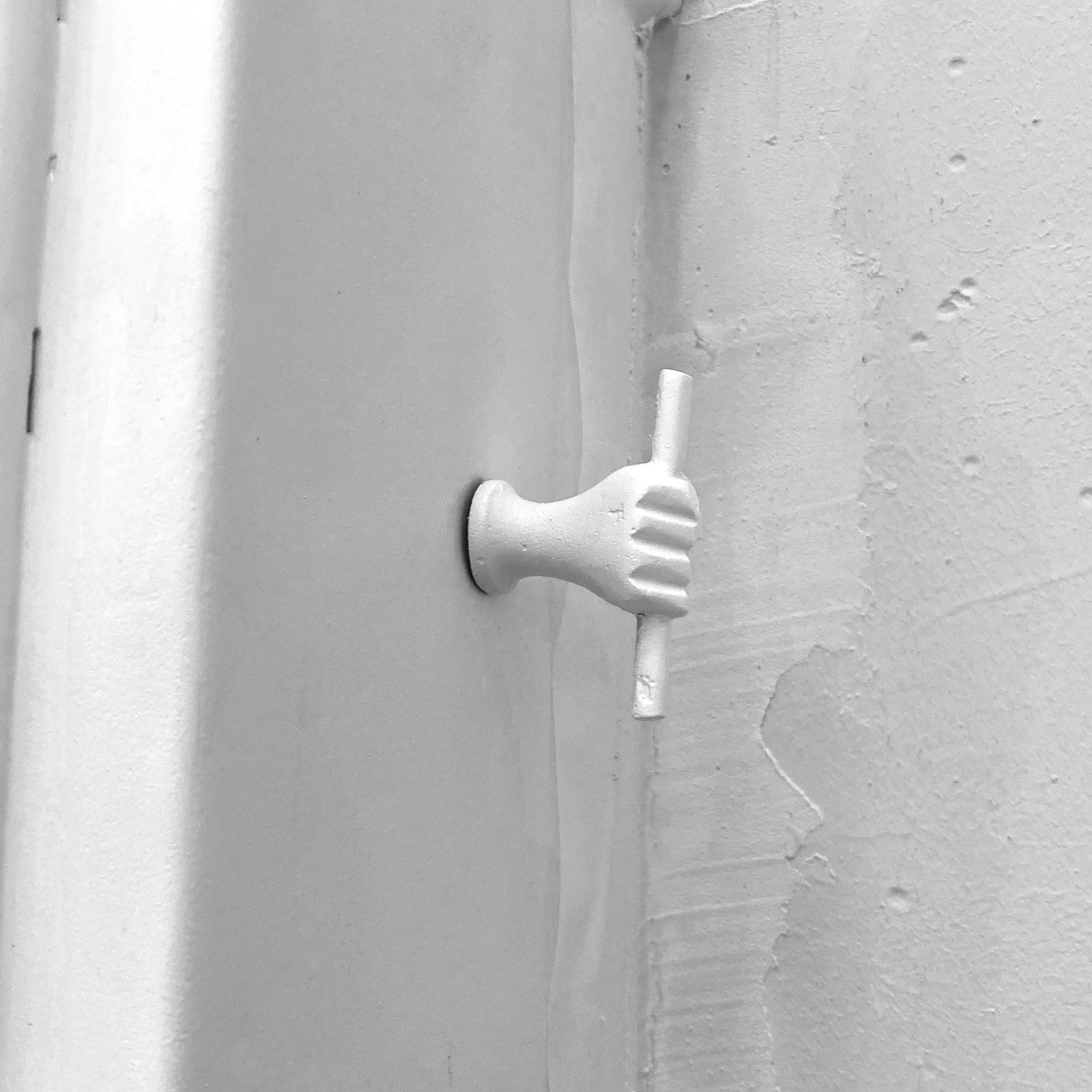


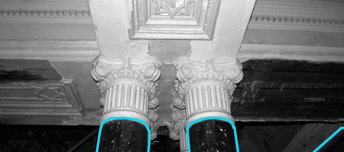
Humming in the background throughout our engagement with this Victorian court house are capitals of neoclassical columns and other esoteric details. Corinthian capitals are lavishly employed in the main courtroom. Ornate details also adorn ionic-style black marble columns in the main circulation space and, as is highly typical across Europe and the global North more widely, they recur so frequently as to be almost imperceptible. They demand our attention even as we fail to acknowledge our paying it. They include the 18th c. representation of sacred date palm trees borrowed, though far more often, stolen, from the mystical cultures of middle eastern religion over 10 thousand years prior. This much has been detailed in Alex Head’s book Ricochet, which explores how culture affects our interior worlds charting this precise history as it’s central entry point. The capitals are also significant to this project because they obscure another form of historical amnesia tied to the erasure of women and women’s subjugation to patriarchy. The Courts makes a point of foregrounding the ‘Whipper of Winston’ narrative of a suffragette who was sentenced there for whipping Winston Churchill. The punishment of another rebellious woman within the buildings’ walls goes unnoticed: this time it is the nymph Acantha. As outlined in Ricochet, corinthian capitals use acanthus leaves in their design. Thought to have been the creative discovery of a Greek sculptor on the island of Corinth, the corinthian capital is said to have been inspired by the funerary basket of a dead young woman with acanthus leaves growing through it’s woven structure. Further investigation reveals that the god Apollo, approaching the nymph Acantha with lust, was rejected, her sharp fingers scratching his face. For this, on one side of the history of Greek mythology, Apollo is said to have transformed her into the acanthus plant that adorns the corinthian columns and so much more classical and neoclassical design. Further evidence of the veracity of this origin myth seems to be confirmed by the fact that the earliest known corinthian columns were found in the temple to Apollo c500 bce. Nonetheless, the intrigue and force of these capitals is enhanced by such strange and archaic symbolism. The curiosity of the esoteric world can feel obscure, frightening even, quite the opposite of what the YAB and Creative Youth Network want for the space today. Keeping one eye on the past uses of the building and the cultural and political sensibilities of its Victorian architects will, we hope, serve as a critical point of departure for the theatrical work of rebuilding the future upon the stage of our mortal world. Unicorns, crowns, snakes and scrolls clenched in human hands - the entire building is steeped in esoteric mythology. Who will unlock the next vault of hidden knowledge?
Co-Design Masterclass and Workshop
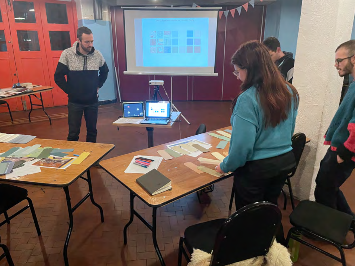
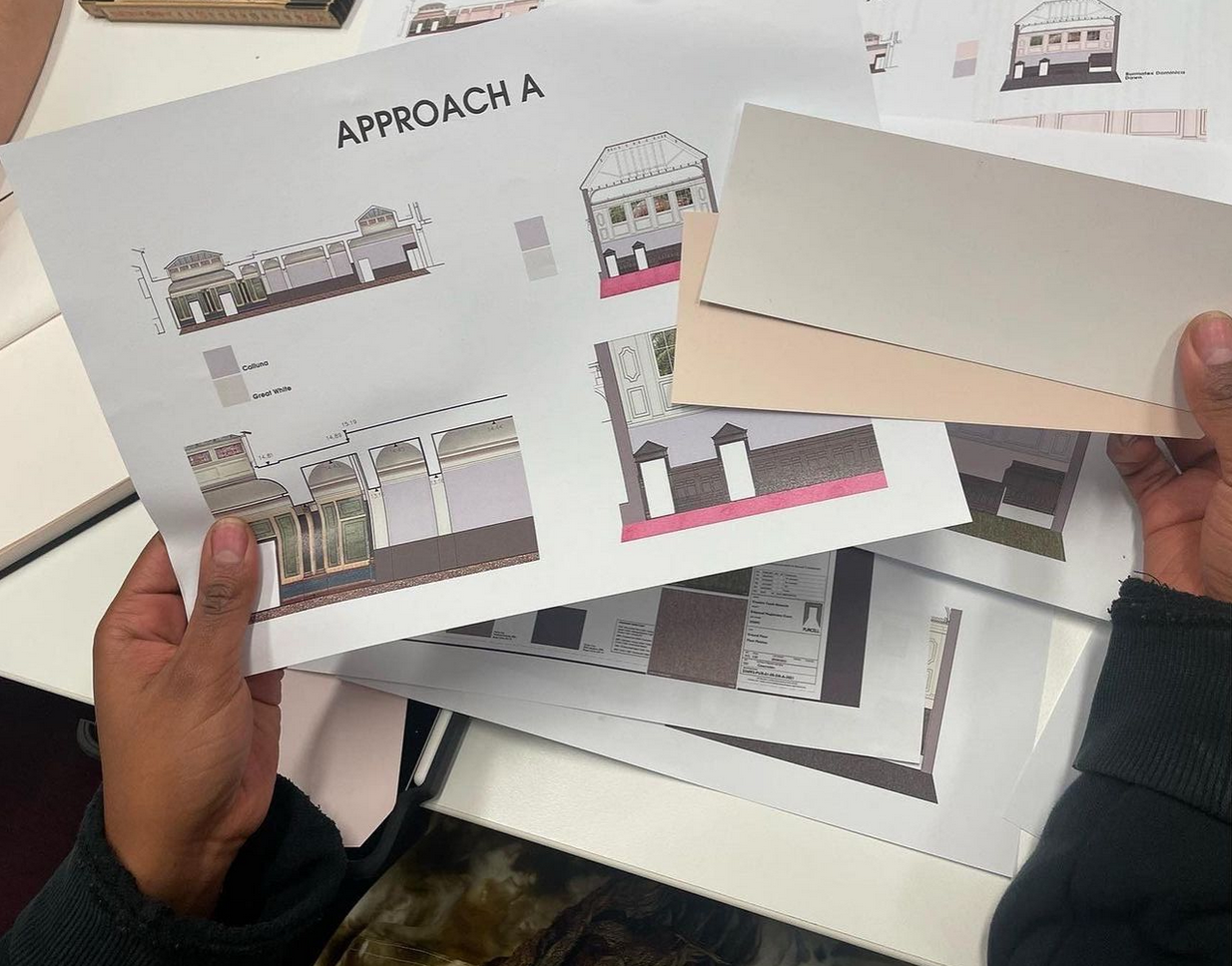
Plural Studio held workshops with CYN and the youth advisory board (YAB) to discuss interior design strategies, atmospheres, as well as colour choices in the building.
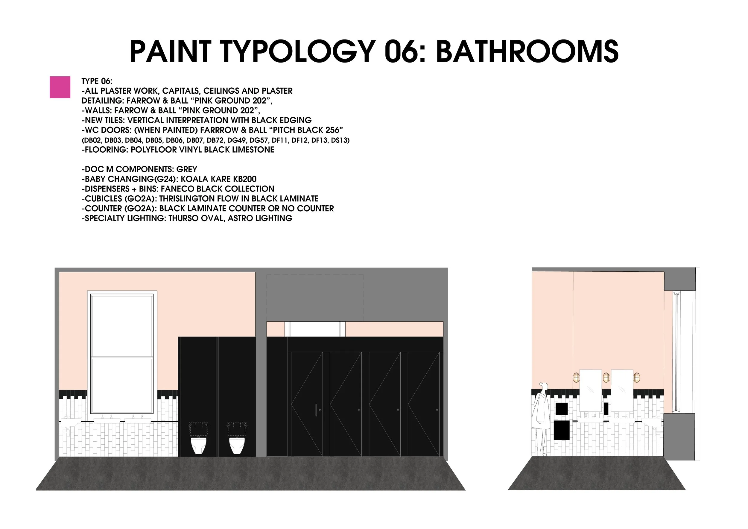
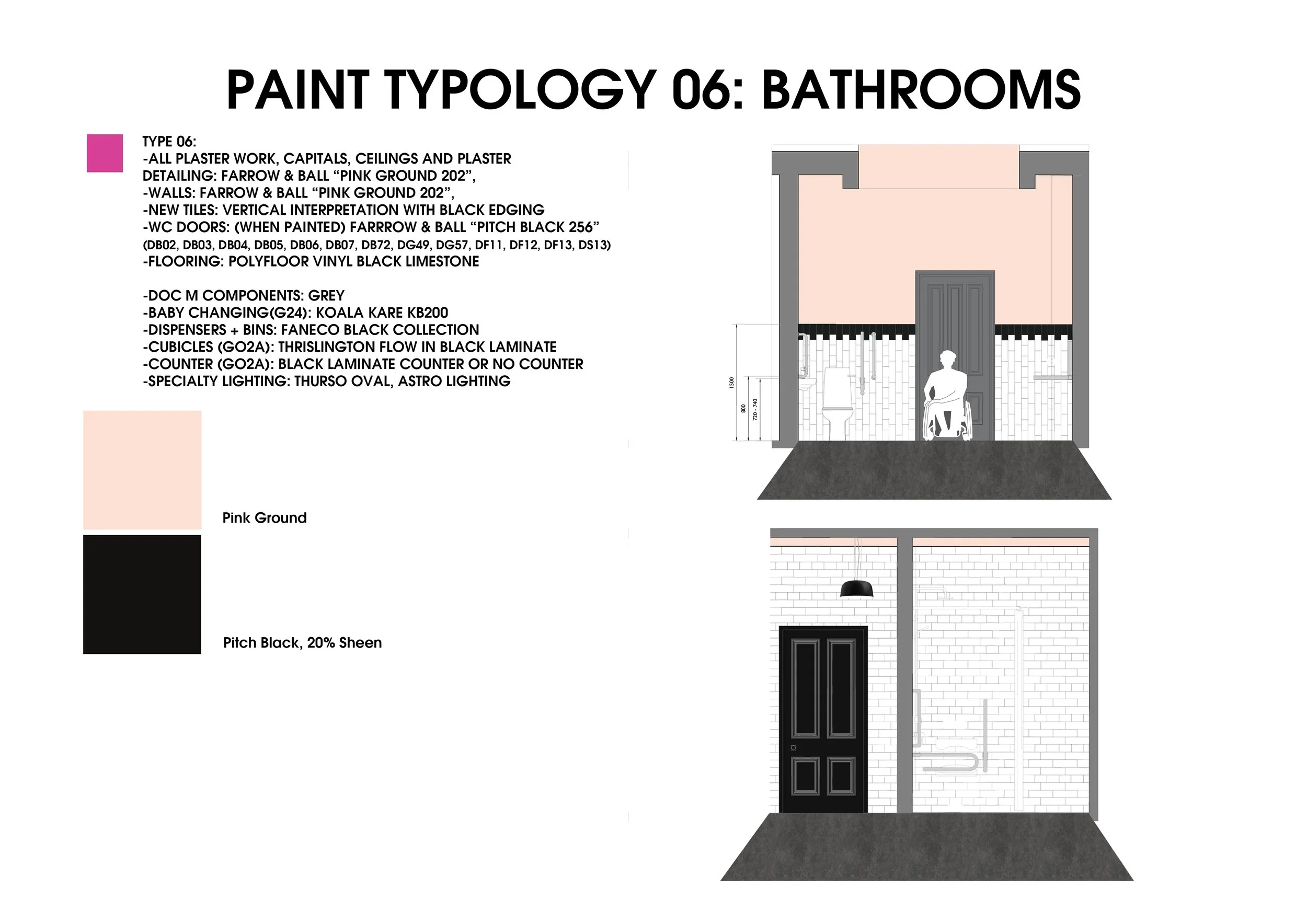
Together with the YAB, colours and material palettes were formalized. Public facing spaces were colour coded with a light pink on the upper walls. The YAB also wanted to show the new appropriation of meaning in one of the former court rooms (planned to be used for co- working) by choosing hot pink carpet as the floor covering.
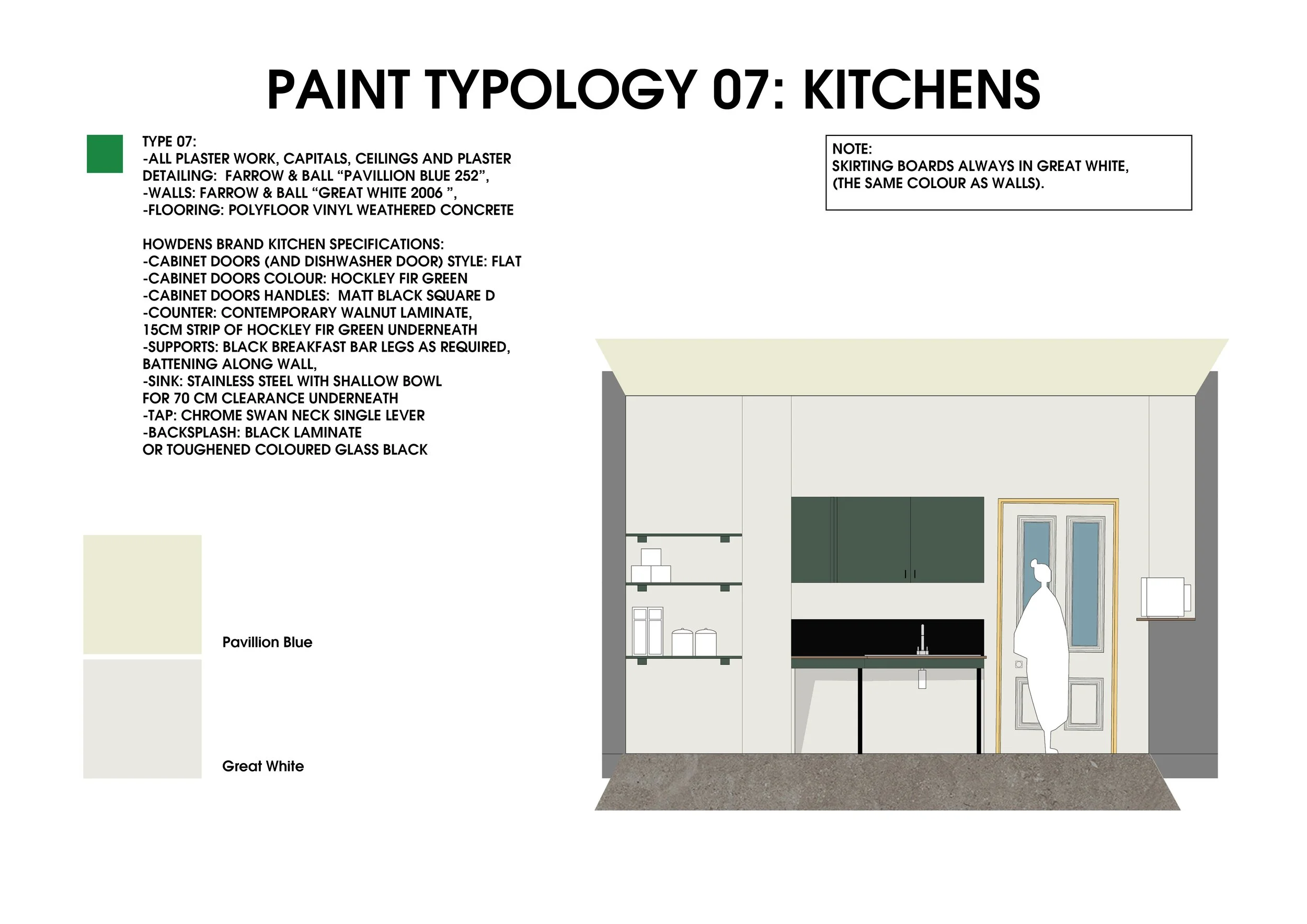
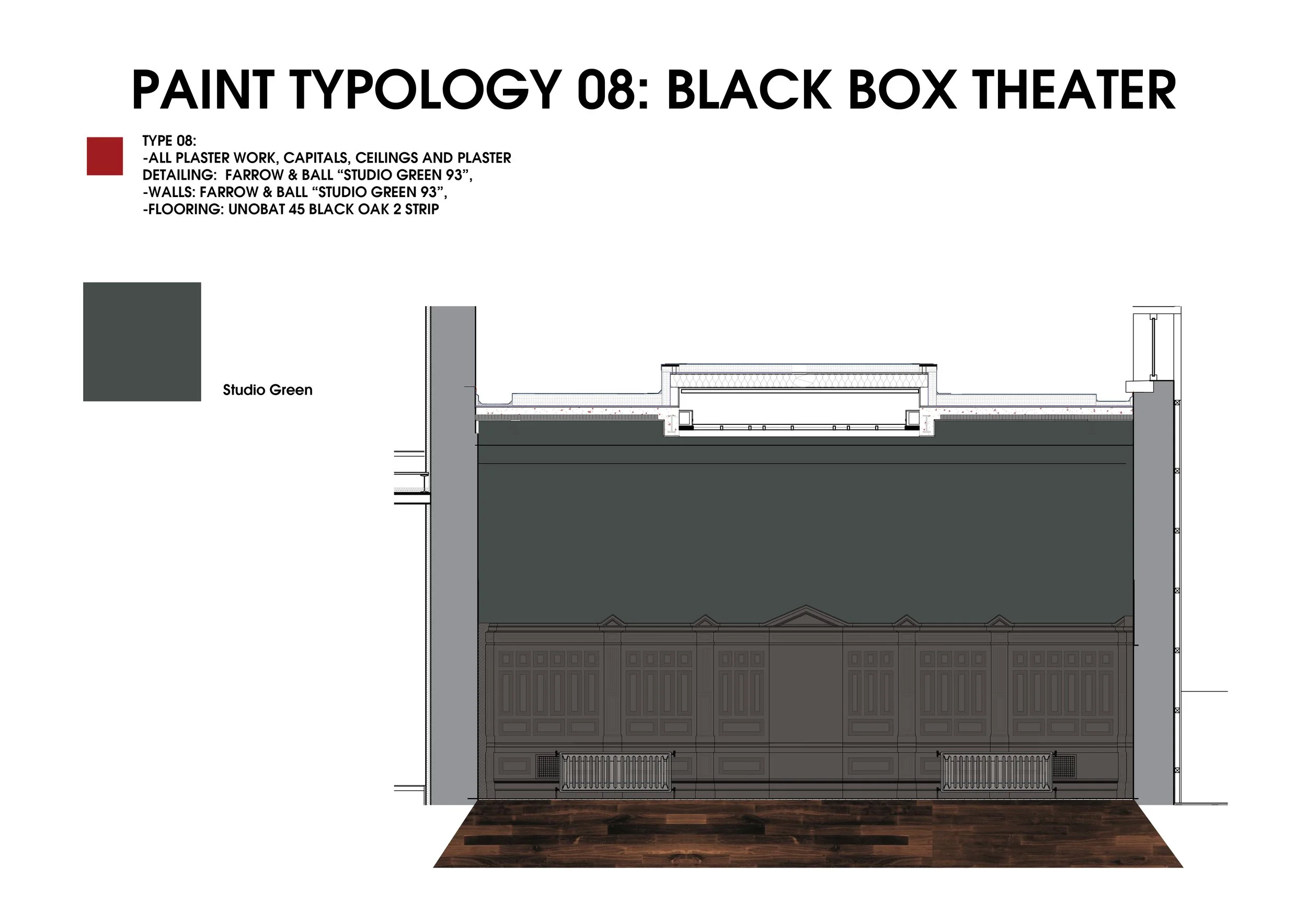
A light green was chosen to colour code hired spaces. A very dark green was chosen for the black-box theater to give the space texture.
Paint Typologies
These drawings communicate complex environments and the non-standard application of colour. A light pink colour has been applied to ceilings, upper plasterwork and capitals. Normally these elements would be painted in a pure white. This choice inverts expectations of a historical environment whose purpose and meaning as a colonial-era court is subverted through the new creative and youth-driven program.
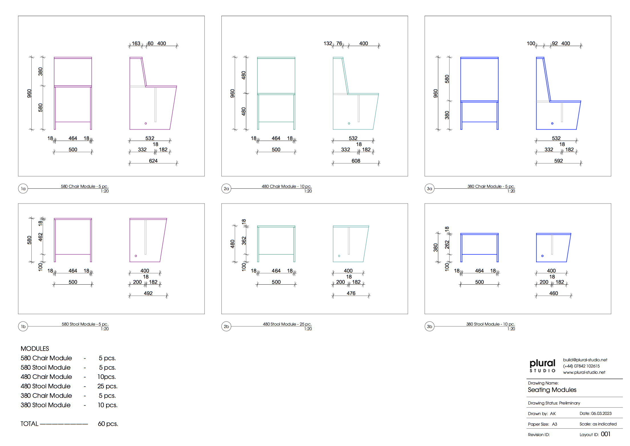
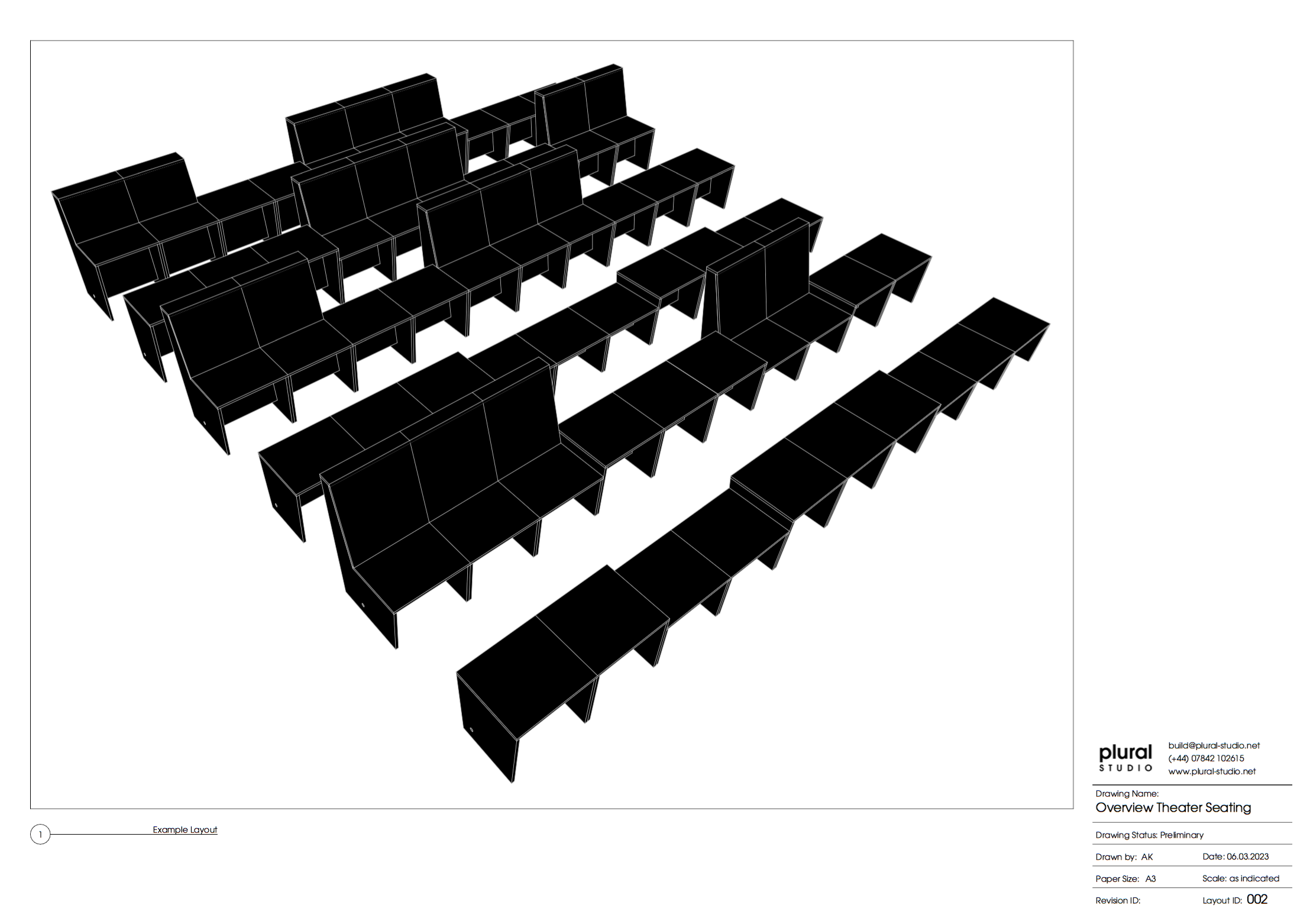
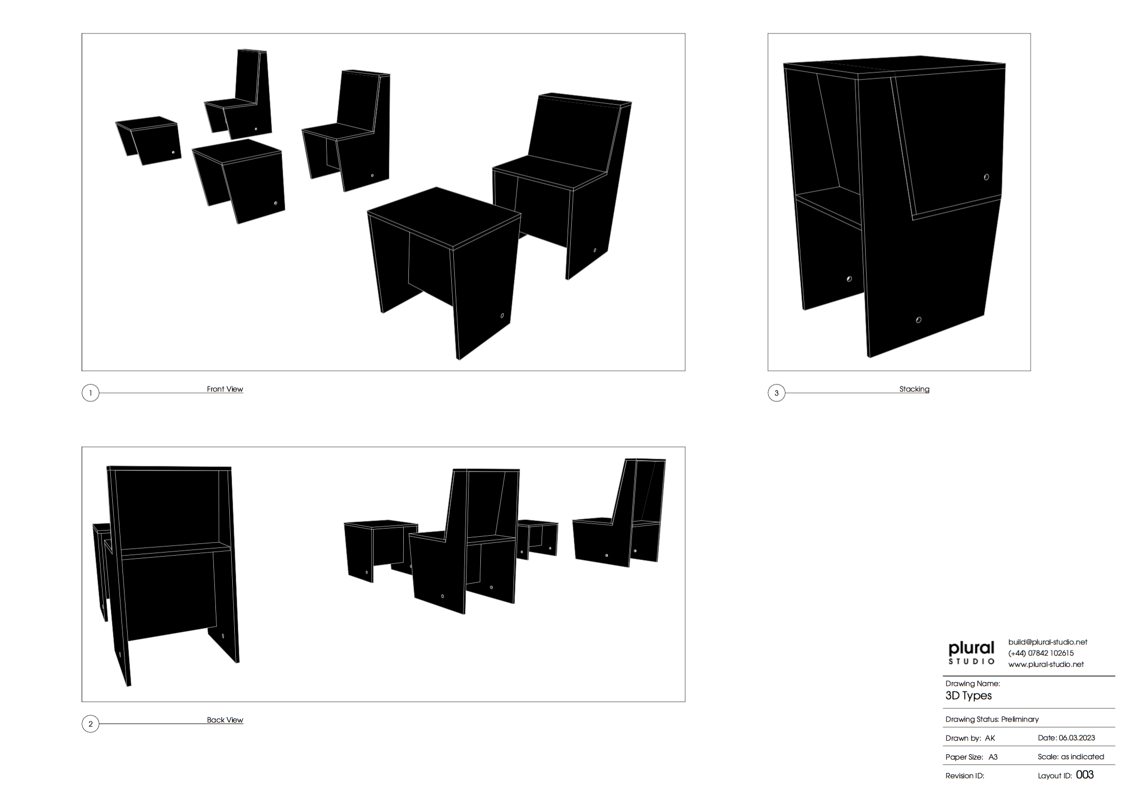
Bespoke Modular Seating
The Courts project information:
Team:
Architect: Purcell
Main Contractor: Bray & Slaughter
Lighting: Qoda
Fire Safety: Hydrock
Graphic Design: Honest Studio
Funders: National Lottery Heritage Fund
and more…
Plural Studio Services included:
- Masterclass on interior design in the context of historic buildings: “Tools for Reimagining the Courts” on responsibility, inclusivity, and engaging history
- Masterclass on colour choices
- Finalized documentation of colour and material choices according to room types for the purpose of communicating with the lead architects and builders
- Tea kitchen design and communication with kitchen manufacturers for tendering
- Bathroom colour, surface, and component coordination
- Proposing a furnishing plan, furnishing schedule and developing a budget
- General communications with suppliers and preparing orders for FF&E
- Designing bespoke furniture pieces for the project, tendering and communicating with fabrication workshops
- checking health and safety regulations for furnishings regarding space requirements and fire safety of the finishes
-Assessment of design choices to fit budgets and reduce costs


